
Overview • Sophie d'Agon
A new look for jewelry, crafted with emotions
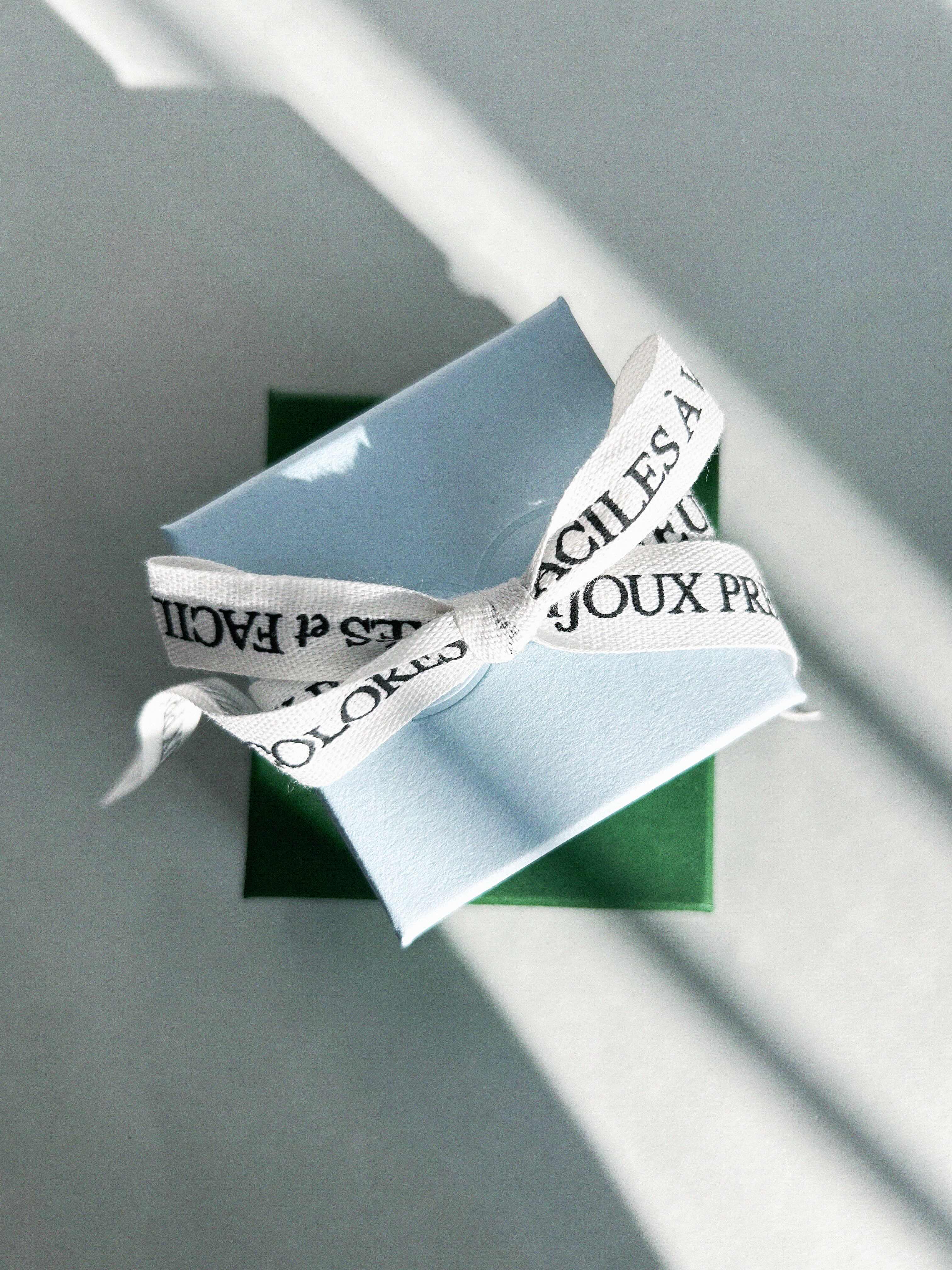
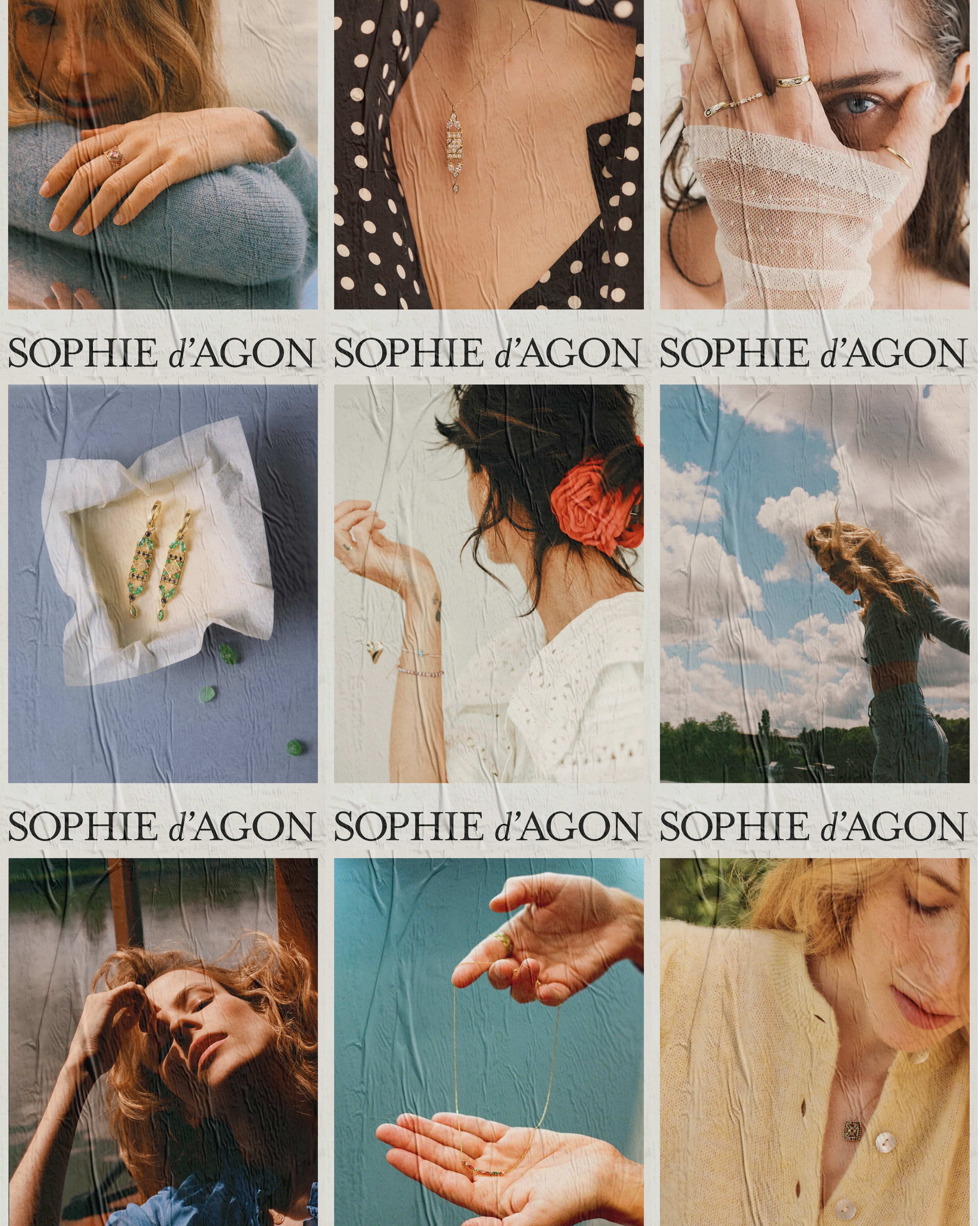
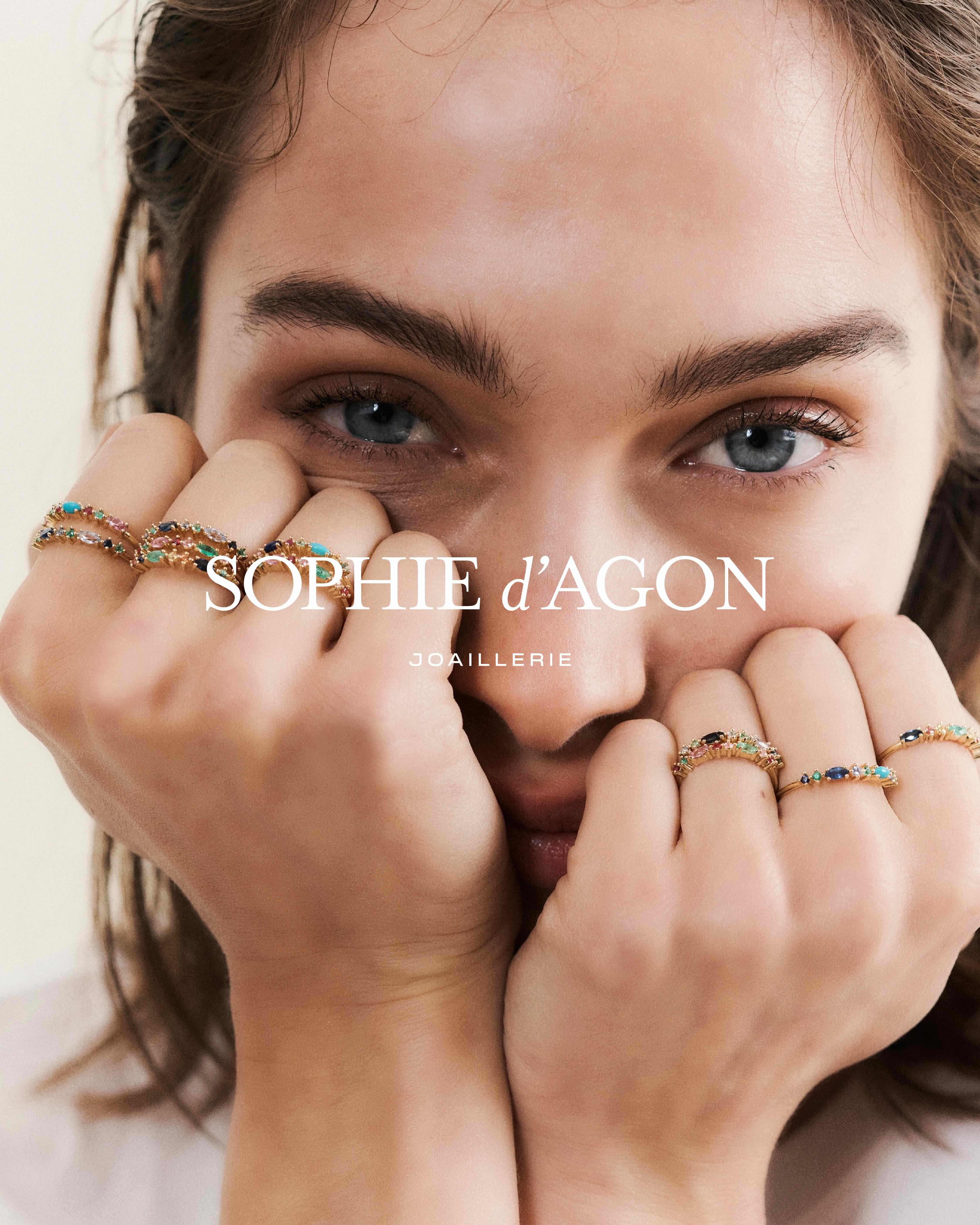
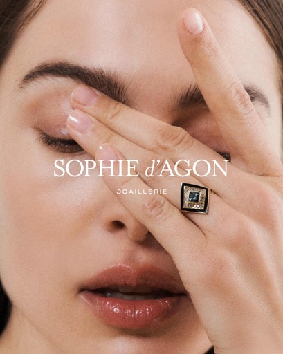
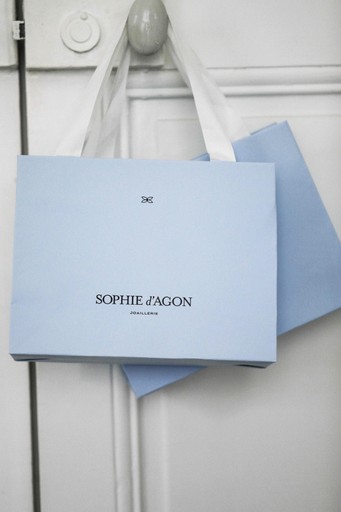
Sophie d’Agon is a jewelry infused with color, emotion, and timeless elegance — a Parisian brand celebrated for its delicate designs and joyful spirit. When her team approached us, their collections were already beloved by a growing community, but their brand identity and digital presence no longer reflected the uniqueness of their creations.
Our mission: to rethink the entire brand platform, from the visual identity to the online experience, and give Sophie d’Agon a fresh, modern look that would capture the emotion behind every jewel — and support the brand’s next phase of growth.
Research
Branding
UX/UI Design
Motion
UX Writing
Collective
Branding : Luna (Cent-Huit)
UX&UI Design : Emmanuel


Thanks
Thanks Sophie, Flora, Abigail and Leslie for your trust and your smart vision. We hope to collaborate for many years.
Special shoutout to Luna — her talent and eye for beauty are simply the best. Really.


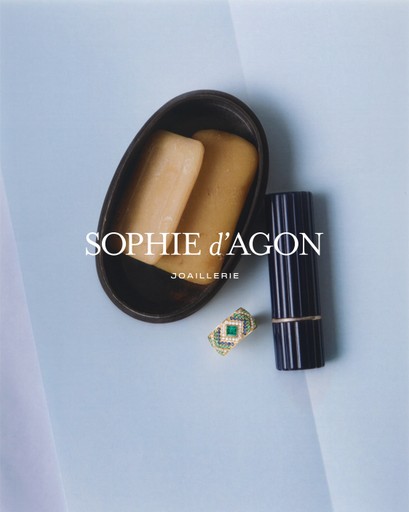
What was the starting point for the new Sophie d’Agon logo?
We began with the idea that the brand’s visual identity and positioning could benefit from more character and boldness. Before diving into the logo itself, we worked on refining the overall visual universe. The existing logo lacked strength and clarity, so the goal was to reinforce the brand’s visual impact — both graphically and photographically — while infusing it with more personality. All of this, of course, had to remain timeless, delicate, and high-end. After all, we’re talking about fine jewelry.
Can you tell us about the small symbol you added?
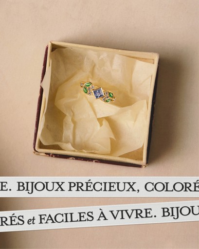
The symbol draws from two key elements in the Sophie d’Agon world: the marquise shape, which is present in many of the brand’s creations, and the original maker’s mark engraved on the pieces — a small flower.
We merged these references into a new emblem: a stylized flower made entirely of marquise-shaped petals, all enclosed in a marquise outline to create strong visual consistency. It’s a discreet but powerful mark of identity.

What was the biggest challenge on this project?
Breathing new energy into an existing brand is always a delicate balance — respecting its DNA while pushing it forward. Sophie d’Agon already had a loyal following, so the challenge was to evolve the image, give it a bolder, less “polite” feel, and elevate its perception without losing its soul. We wanted it to feel more premium, with stronger character, but still joyful and accessible — that’s the charm of Sophie d’Agon.
What’s your favorite detail in the final identity?
The rhythm of the logo. The contrast between the classic, uppercase serif letters and the small, italic lowercase “d” creates a subtle tension — a sense of movement, lightness, almost spontaneity. It’s a quiet dynamic that really reflects the spirit of Sophie’s world.
How was the collaboration with the Sigmoon team?
Truly a pleasure! At first, Sophie d’Agon reached out to me through my studio, Cent-Huit, to work on the branding. But it quickly became clear that the website also needed a full redesign — and I immediately thought of Sigmoon for the digital part. Emmanuel is incredibly talented in his field, and we shared the same vision and attention to detail. The collaboration was smooth, complementary, and genuinely enriching.


Sophie Lepourry
Founder, Sophie d'Agon
Beyond the brand — Turn emotions into action.
A beautiful brand is nothing without a smart, efficient digital experience. We didn’t just refresh the look — we completely rethought the online journey to make it more fluid, intuitive, and conversion-focused.
Every UX decision, every UI detail, every line of copy was made to simplify navigation, highlight the jewelry, and drive conversions.
— Rethought the entire purchase funnel, from homepage to checkout
— Designed a clean, mobile-first navigation to simplify product discovery
— Enhanced product pages to showcase details and storytelling
— Optimized the add-to-cart and checkout experience for faster conversion
— Crafted every UX copy to support the brand’s voice
— Balanced design and performance to help grow online sales


To maintain consistency across every aspect of the digital experience, we built a comprehensive design system. This toolkit ensured that every element, from typography to iconography, worked together seamlessly across the entire website and branding. It’s about creating harmony—no matter which page, touchpoint, or interaction the user is on.

Screenshot Figma - Sophie d'Agon Design System
+25%
online conversion rate
+18%
average time spent
x2
Add to cart rate
+33%
Funnel completion