Overview • 38.2 Medical Center
38.2 came to us with a bold mission: to revolutionize the image of medical practices.
They didn’t want to follow the well-worn path of sterile, conservative healthcare branding. Instead, they envisioned something different—an identity that would feel fresh, youthful, and forward-thinking, while still grounded in professionalism and trust. But unlike most healthcare brands, this one wasn’t built with patients in mind.
The entire branding was designed to speak to doctors—and only doctors. 38.2’s priority was clear: attract a new generation of medical professionals by offering a radically better work environment, and a strong, inspiring brand to match. Before they could change the way care is delivered, they needed to build the team that would deliver it.
The challenge was clear: how do you inspire trust and confidence while daring to innovate in a highly sensitive sector? That’s where we came in.
Branding
UX/UI Design
Data analytics
UX Writing
Signage design
Webflow
Collective
Brand & UX UI : Emmanuel
Webflow : Samuel
Interior Design : Adrien (Topla)


Thanks
We love all our clients—but let’s be honest, 38.2 is our number one 💛💜
They’re doing things incredibly right. Not by trying to revolutionize everything, but by making it all 100 times better. We’re seriously in love with the team, and completely aligned with their mission.
9.6/10
Brand Net Promotor Score from a panel of 150 GPs
4.9/5
Trust score from patients who visited the first 38.2 med center
78%
Home page engagement based on scroll and clicks
98/100
Google SEO score in the first 3 months after website release
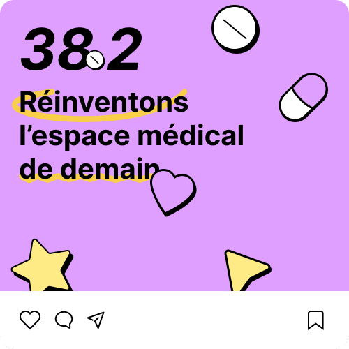
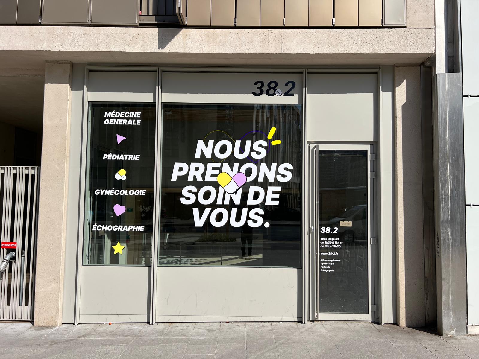
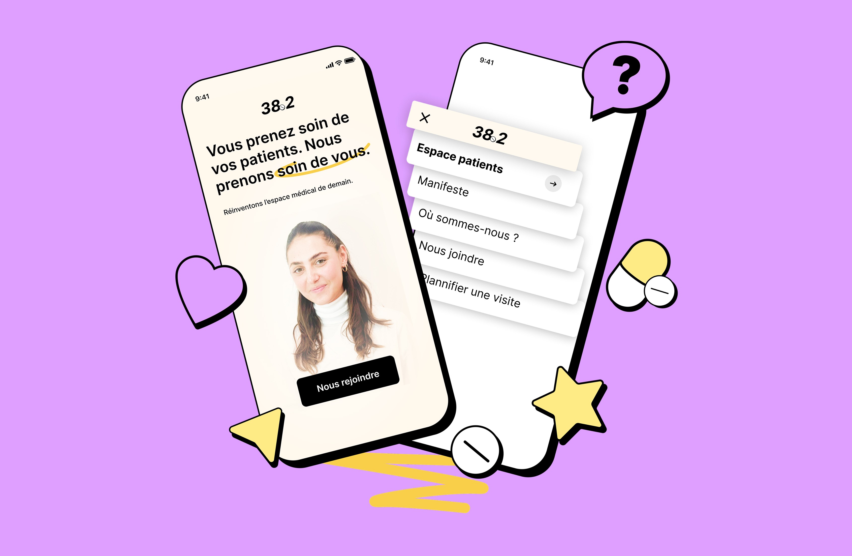
A brand that speaks to Doctors
Our journey began with a collaborative brainstorming session at Sigmoon Studio to create the brand name. After exploring various concepts, "38.2" emerged as the ideal choice, symbolizing the temperature at which a patient is considered sick. This name aligns with the brand's medical expertise and serves as a metaphor for urgency, precision, and care.
This naming process became the cornerstone of the brand identity.
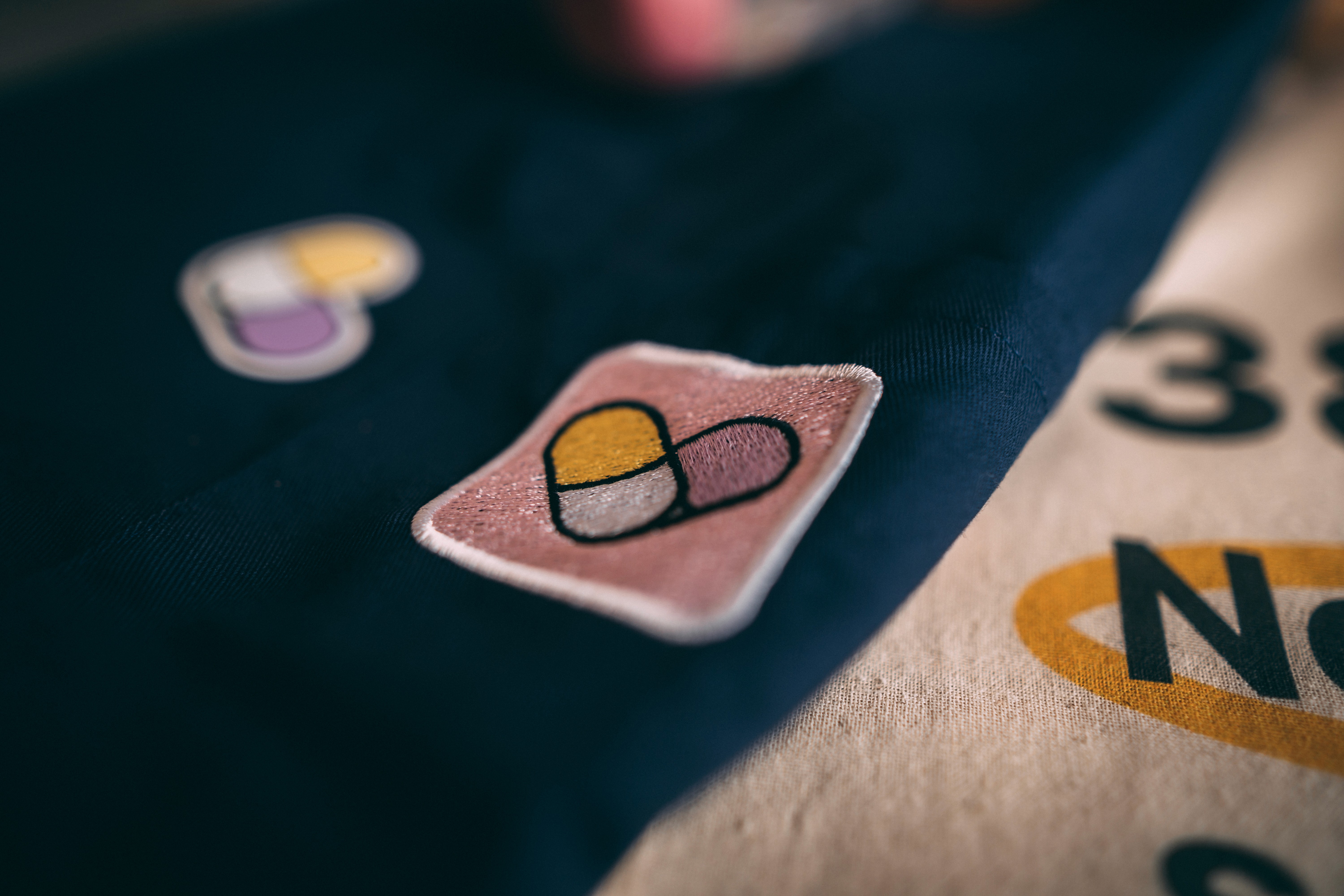
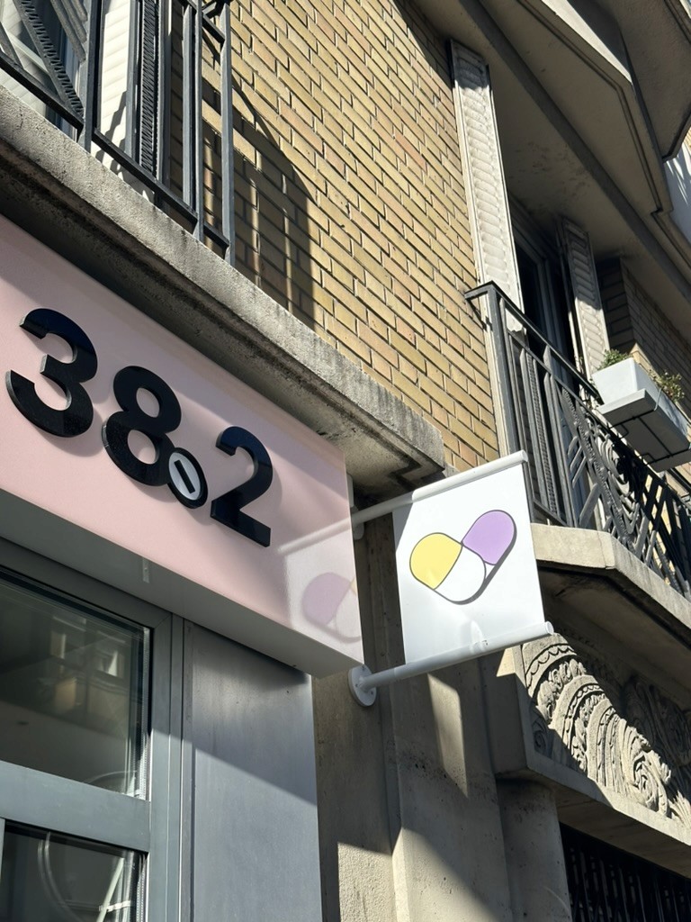
From there, we designed a modern and reliable visual language, including a vibrant color palette, approachable icons, and a clean, professional logo. Together, these elements reflect the principles of swift diagnosis, effective treatment, and an unwavering commitment to patient wellbeing. The result is a brand that balances trust and innovation, positioning 38.2 as a fresh yet dependable presence in healthcare.